The Consumer's Hierarchy of Preferences: Assessing Retail Strategies with The Inventory Value Capture Index
Speedwell Research: Business Philosophy Series
“How can you count what matters if what matters isn’t counted?”
The Value Capture Index.
We started our last piece noting that, at the extremes, there are two strategies in retail: 1) work hard to get people to accept a high price for your product, or 2) work hard to get your product cost down so you can charge a low price.
Naturally, the question arises as to which strategy is better: Strategy 1 (convince people to pay more) or Strategy 2 (work to bring costs down so you can charge less and sell more). At its core though, this question can essentially be reframed as a tradeoff between margins and turnover: How much does inventory turnover need to increase to offset a lower margin?
We know that Costco has the lowest margin of any retailer at 3%, but they make up for it by selling a ton of inventory quickly (their annual inventory turnover is ~12x). To address this question, we developed a metric called the “Inventory Value Capture Index”. This metric allows us to compare retailers who embark of either Strategy 1 or Strategy 2 on equal footing.
To start, we re-calendarized some financials because the companies’ fiscal years are not aligned. Adjustments are noted in the table below.
We then calculated select operating metrics from various retailers (see table below). We show pre-pandemic revenues and full year 2021. This was done because it allows readers to see how these models looked in a normal operating scenario (2019) and in a more extreme one (because of logistics issues, lock downs, and covid stimulus). The table also shows gross margins, operating margins, and inventory turnover.
Clearly, Hermès, with their 71% gross margins, 39% operating margins, and an inventory turn ratio of 1.1x, is employing Strategy 1, whereas Gap, with their 53% gross margins, 5% operating margins, and inventory turn ratio of ~4x, appears to be employing Strategy 2. There could be some idiosyncrasies in each specific year or each company’s financial definitions that skew the metrics, but we think these metrics help frame the retail landscape.
The two strategies hinge on two key variables: margins and turnover; however, there is no standard metric that deals with how much margin is worth giving up for more turnover, or vice versa. In order to more thoroughly understand whether 1) the tradeoff between price and volume is yielding desirable performance and 2) to compare retailers who have decided to embark on different strategies, we created a new metric we call the “Inventory Value Capture Index”.
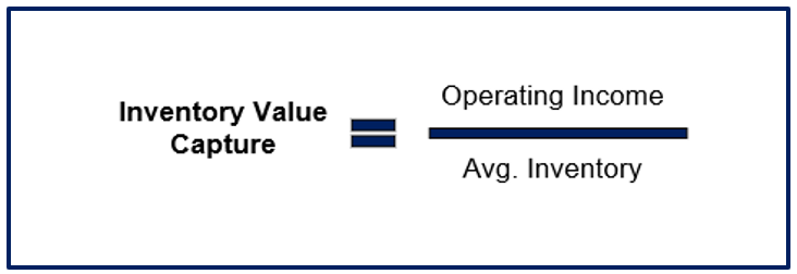
This metric takes into account the tradeoff between higher inventory turnover and higher margins. The Inventory Value Capture metric is calculated as operating income / average inventory. Conceptually, the idea is to see how well a company turns a dollar of inventory into operating profit, while also taking into account how much inventory is needed to sustain that level of operating performance.
We use operating income as the numerator because it is a fully loaded figure that includes the inventory and operating costs in full. This is because some operating expenses are necessary for a retailer to charge high prices.
Some might be tempted to use gross profit, but we wanted to fully load the cost structure for all SG&A expenses in order to get a holistic impression of a company’s performance. For example, a high advertising expense might be essential to convince customers to pay more, and increasing the number of designers can grow a company’s product line and increase unit sales, but both of these expenses are recorded below the gross profit line. Since we want to capture the costs of all activities that support sales, we use operating income, which accounts for all of a business’ core costs.
For the denominator, we use average inventory to tie the metric to inventory turnover and inventory intensity of sales. The higher a company’s turnover is, the lower average inventory they would hold per dollar of revenue generated, and thus their performance on this metric would be better as more operating profit dollars are attributed to less inventory. Conversely, if a company has a lower inventory turnover ratio, then more inventory is held per dollar of revenue generated, which saps the company on our metric. The correlation between inventory turnover and inventory as a % of sales is shown below (R2 is high at 0.81).
The higher inventory as % of sales is, the higher the inventory intensity of sales. The implication of this high correlation means that a company can’t just reduce inventory without it impacting sales (by and large). If they did reduce inventory (which would improve the denominator), then the numerator (sales x operating margin) would be adversely impacted.
We break out the formula below to make that explicit: notice that sales is on the top and average inventory is on the bottom, which would get us sales per dollar of average inventory, the mathematical inverse of average inventory as % of sales, which we previously showed has a high correlation to inventory turnover.
Thus, this metric accounts for the two variables that we want to focus on—turnover and margin—to answer our question of which retail strategy creates more value (Strategy 1: convince people to pay more vs Strategy 2: charge less and sell more).
In summary, meshing these two financial figures gets us operating profit generated per dollar of average inventory held. The output essentially is how well each dollar of inventory is monetized. We dub this “Inventory Value Capture”, and think it is a clean way to compare retailers who utilize very different strategies.
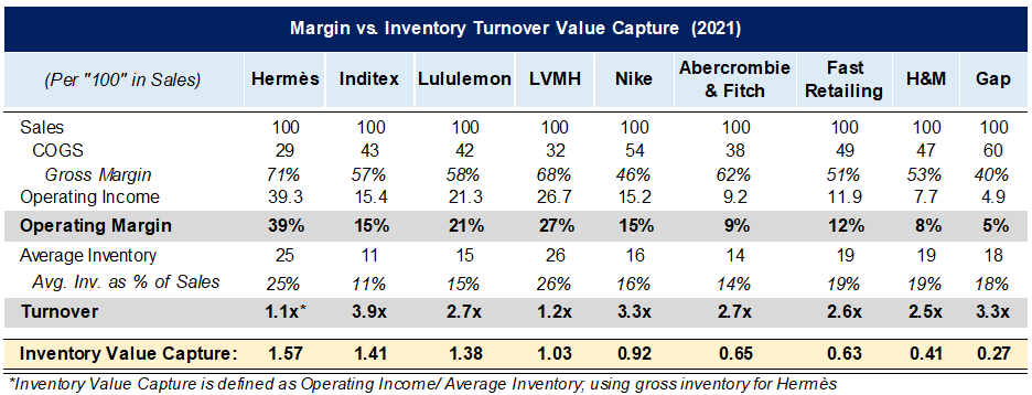
To apply this to our group of peer companies below, we start by common-sizing sales at “100” and input their respective operating metrics. We then back into average inventory by dividing COGS by their inventory turnover ratio, followed by taking their operating income (operating margin x 100) and dividing it by average inventory, which gives us the Inventory Value Capture ratio for each company.
Using this method, we can observe some interesting insights. Hermès and Inditex come out as the leading retailers despite very different approaches, with Inventory Value Capture ratios of 1.57 and 1.41, respectively. Whereas Inditex has a turnover ratio of ~4x, Hermès is barely at 1x. But Hermès wallops Inditex with margins that are >2.5x higher. The net of this means that for every dollar of inventory Hermès holds, they turn it into $1.57 of operating income—more than any of their peers. However, Inditex is close behind, despite their very different financial profile. Hermès is the embodiment of Strategy 1, whereas Inditex works hard at Strategy 2. As you can see, either strategy worked at dutifully, can lead to retail success.
Now, the last piece of this is tying back the financial analysis into a qualitative understanding of the company. Does the strategy each retailer is embarking on make sense in the context of their “Consumer’s Hierarchy of Preferences”? Answering this question will require an understanding of the individual company’s value prop and whether it is consistent with their high price / low turnover or low cost / high volume strategy.
Thank you for reading Part 3 of our Consumer’s Hierarchy of Preferences series. You can find Part 1 here and Part 2 here.
The Synopsis Podcast.
Follow our Podcast below. We have four episode formats: “company” episodes that breakdown in-depth each business we write a report on, “dialogue” episodes that cover various business and investing topics, “article” episodes where we read our weekly memos, and “interviews”.
Speedwell Research Reports.
Become a Speedwell Research Member to receive all of our in-depth research reports, shorter exploratory reports, updates, and Members Plus also receive Excels.
(Many members have gotten their memberships expensed. If you need us to talk with your compliance department to become an approved vendor, please reach out at info@speedwellresearch.com).


Where does the Operating Margin figure come from? Is it what they report it as?